This is a work I designed based on the painting, below, by Geraldo de Barros. The original (an enamel, 23.5" x 23.5", 1952) is in black, white, and light blue. The hues and shapes do indeed appear to show movement, or, at least, tension.
.jpg)
I did my version (29" x 29") in the primary (rainbow) colors. It does not have the same sense of movement as the original, but I believe that the bright colors and interplay of the shapes against the stark black background do have an interesting vibrancy.
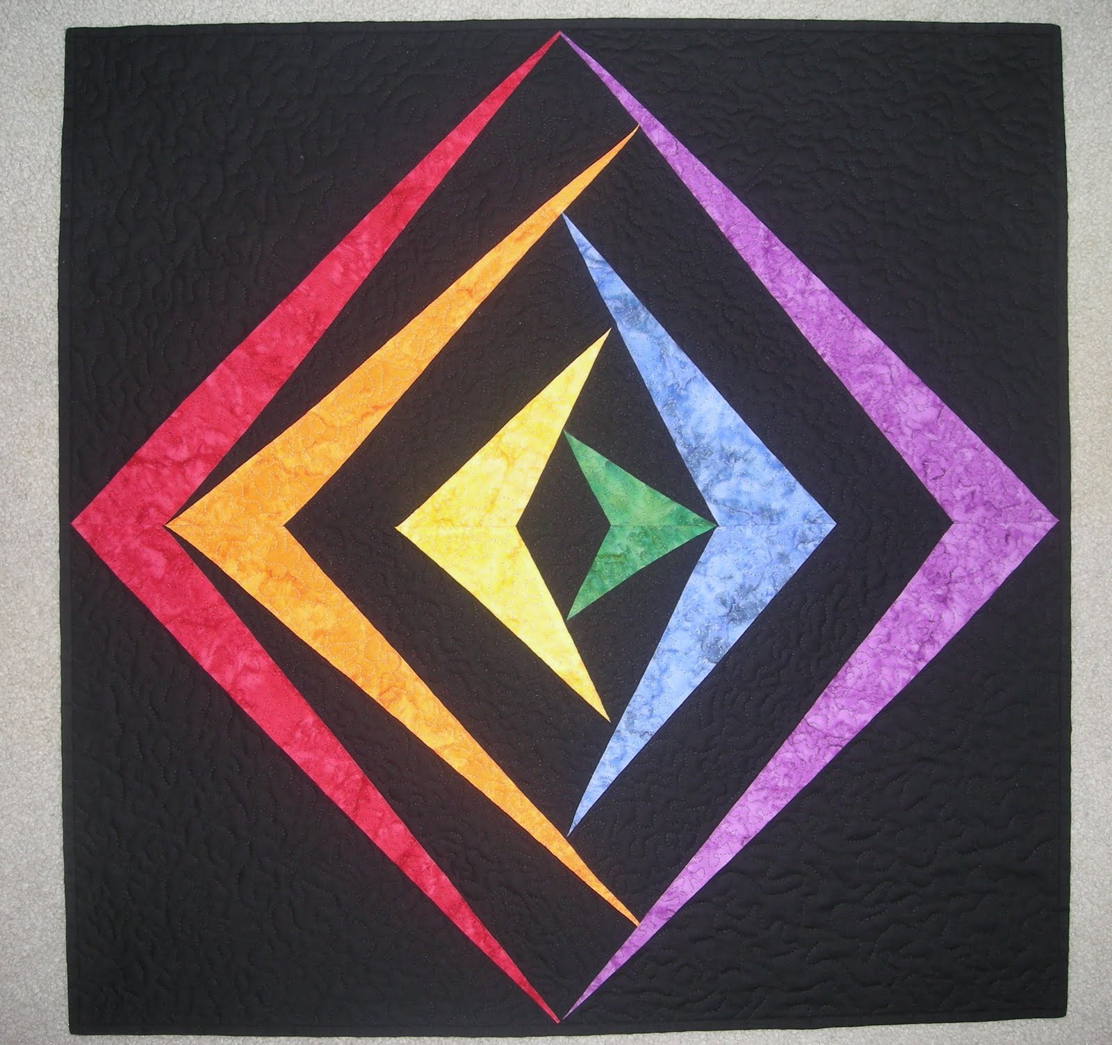
For the quilting, I chose to do stipling. The thread colors
match the black or colored fabrics. So if one looks at the back of the quilt
(which is a solid black fabric) the outline of the points and counterpoints on
the front are clearly visible.

2 comments:
i like it!!
I love the cool side vs the warm side. Damn it, Wayne, this is another quilt of yours that I want to imitate in one fashion or another!
Post a Comment